When designing these sell sheets, I always pay close attention to the label. The client often chooses this design, so I try to study it and replicate it while also adding on. I feel like this project is a great example of how I tackle something when the label is fairly simple.
OBJECTIVE: Design a sell sheet that promotes while including product specifications and blurb
SOFTWARE: Canva
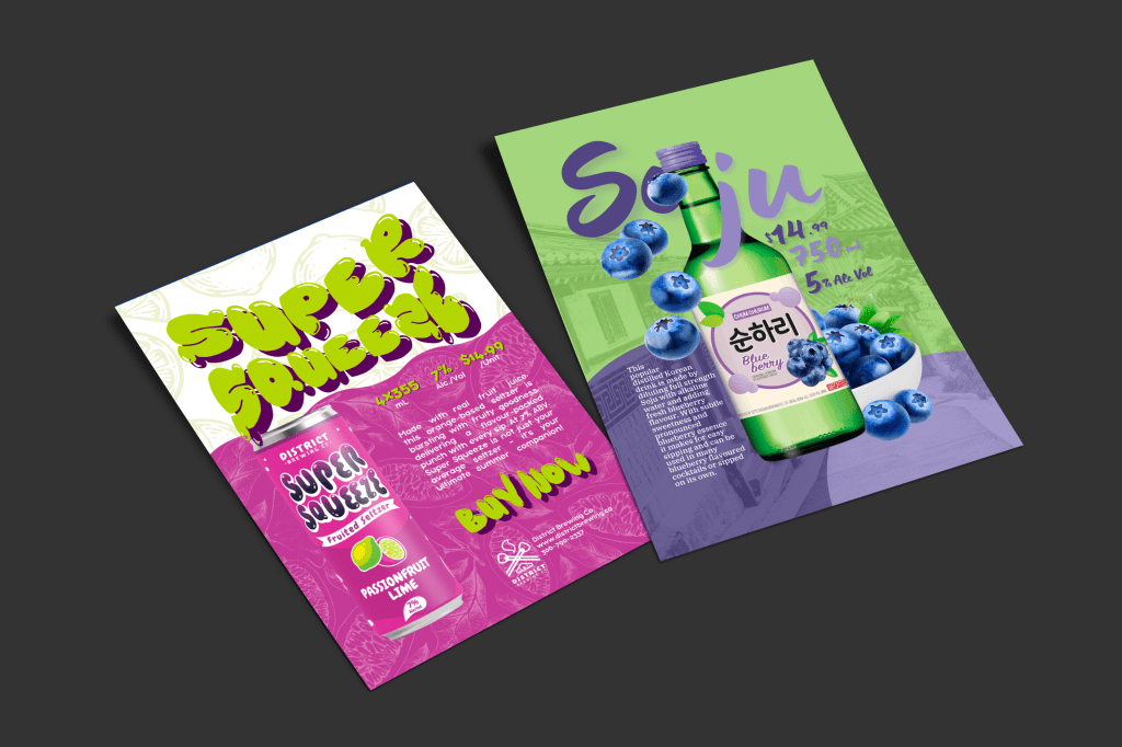
Soju Sell Sheet
PROCESS: What I first noticed about the label was all the circles, from the shapes to the blueberries to the roundness of the font. I knew that would have to be incorporated into the design. When I think of the Korean language, I think of the brush stroke quality of their alphabet, so I knew I would want to use a brush-style font in Canva. I wanted the first part of the letters to go behind the bottle, the second part over, and then for a blueberry over the ‘O’ because I knew it would create some variety.
I chose the blueberries to draw people’s attention to the flavour. I often see an ingredient falling in a lot of ads because it can add movement that draws attention. The bowl of blueberries is to make sure the design is even and further emphasizes the flavour.
For the background, I looked into images of Korea to highlight the heritage of this brand. It could easily be something that sets them apart as most other alcohol products on this page and in stores are Canadian or American. I put the two circles in the background and added blend modes to show the background to add attention to the bottom of the design and to show off this bubbly drink.
Super Squeeze
PROCESS: I knew right when I saw this can that this product would be a fun one to design for, from the bubbly font to the playful illustrations and dots. An idea quickly came from the name of the product, Super Squeeze. Why not use a text effect to make the letters look like they’re being squeezed? I made that happen in Canva.
Next, I wanted to highlight the unique combination of flavours. I used patterns of the two ingredients and set them to a low opacity as a fun detail instead of an attention grabber. When doing sell sheets, I always view the name and product photo as equally important as they both tell people what to look/ask for but often choose to emphasize one a little more to make sure they’re not competing.
For this sell sheet, I would say that the product name is the most important element as it’s first and in a green that’s only used in smaller quantities throughout the design. While the photo is very important so people know what to look for at stores, I often try not to make the product too big of a focus as it can just seem like a poster of a picture, rather than leading with or highlighting text so it feels more like an ad or an experience. As well, due to the shape of the bottles and cans, they can’t take up space horizontally the way text can.
After that, the next most important element to me is product information, as people are not likely to skim or skip such small text, and it provides vital information to people wanting to buy the product. I thought a great way to emphasize that would be to put it in bright green. Hopefully, you’ve understood by now that I like to challenge myself, and that’s exactly what I did by choosing justified text that required a lot of formatting to look its best.
I then wanted to bring back the squished, bold text and thought it would be perfect for a call to action in this ad.
REFLECTION: For this project, I learned a lot about making a sell sheet. I’m used to doing advertisements or flyers, often advertising a specific thing, but a sell sheet is supposed to just give retailers information on the product. I gained experience balancing product information with design.
