OBJECTIVE: Raise awareness about an upcoming Food Drive, and build empathy towards people facing Food Insecurity
SOFTWARE: InDesign and Photoshop
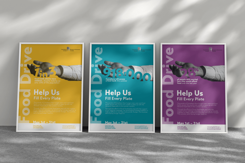
PROCESS: When designing posters for the Regina Food Bank’s Food Drive, I first thought about how I could represent hunger visually. I didn’t want people to just look at the posters and recognize an event was happening; I wanted them to feel for the people experiencing hunger. I wanted them to remember what hunger feels like.
Negative space felt like the ideal way, as it shows an absence of something. This was the exact message that I was trying to display. I decided I wanted a hand reaching out to further humanize the people experiencing food scarcity, and to make it seem like the person was reaching out to the viewer. I wanted the hands to be in black and white to exhibit the need, as if the person’s colour was fading. Now that I had a human element, I knew I had to put the statistics over it to get that negative space.
I used the Regina Food Bank’s main colours to create three cohesive posters in InDesign. My instructor suggested I add a slight tint to each hand of the background colour, to make it blend a bit better, and so I added that in Photoshop.
I had some trouble getting the statistics to stand out on the posters, so I played with placement and drop shadow until I got them as legible as possible. After this, I decided to change the font as I wanted something much cleaner to make the visual focus. Finally, I changed up the layout to add more movement to the design.
REFLECTION: Working on a project for such an important issue allowed me to learn how much design can convey meaning and emotion. I also got practice working with different elements in different programs, and focusing on smaller details like the drop shadow and placement of let
