Grand Budapest Hotel Movie Posters
OBJECTIVE: Design 2 complementary movie posters for the Grand Budapest Hotel that fit its aesthetic while also telling a story
SOFTWARE: InDesign, Illustrator, and Photoshop
PROCESS: I fell in love with the aesthetic of the Grand Budapest Hotel when I watched it, and I became determined to do the best job possible representing it. The movie’s main characters are completely infatuated with the hotel, so I wanted that to be my focus. I wanted to show two sides of the hotel, the dreamy one they loved and the darker version hinting at the deaths in the movie.
For both posters, I edited the photos in Photoshop, did the logo in Illustrator and put it all together in InDesign.
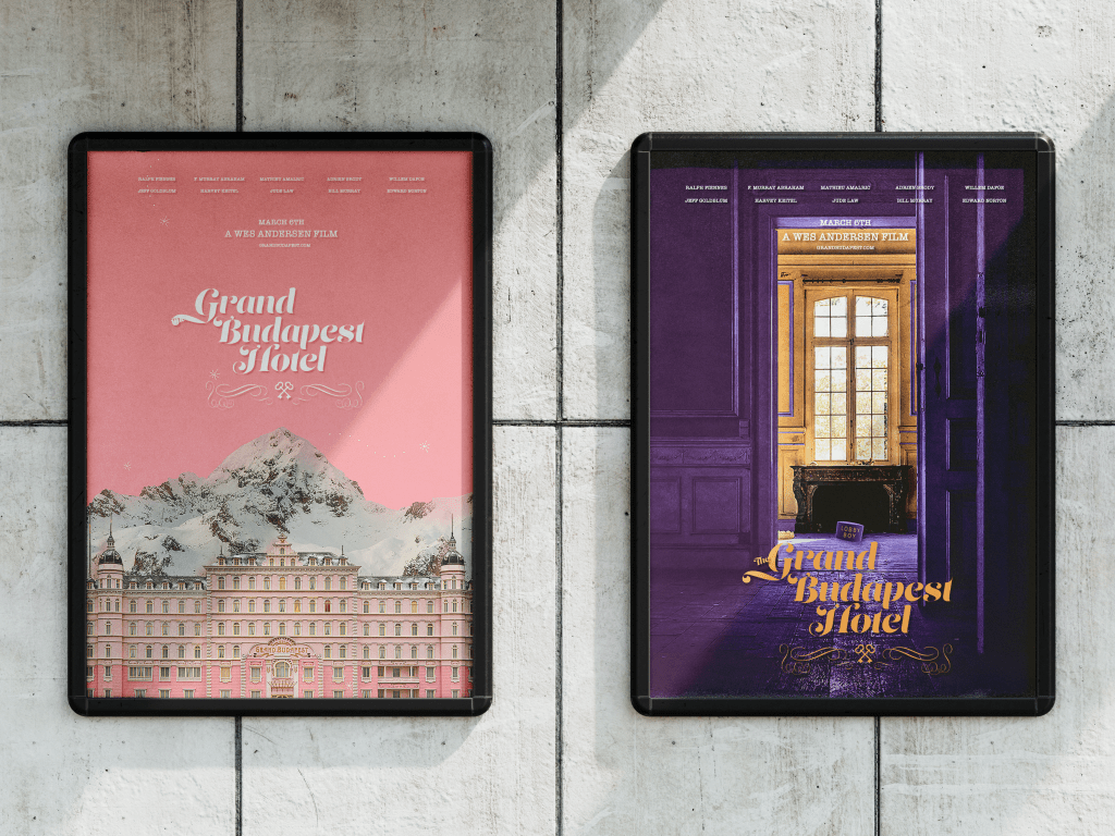
For the first poster, I used the hotel’s main colour, pink, and a beautiful shot of the hotel in the snow. I added snowflakes to keep that feeling of winter. I also added a drop shadow to the text to give it a vintage look.
After that, I found a fancy font with glyphs so I could create a personalized logo for the Grand Budapest Hotel. When watching the movie, I kept my eye out for important symbols that I could add in, and the keys caught my eye instantly. The hotel is upscale, so I wanted something very fancy, with lots of flourishes and decorations, and I believe I achieved that.
For the next poster, I wanted to show the darker side of the hotel. I chose purple and yellow as that’s the colour of the lobby boy’s hat, which I knew I wanted to include. I wanted to overemphasize the connection the characters have to the hotel, as if it’s a part of the time.
Finally, I wanted a sense of something foreboding. The movie develops into chaos very quickly, with staff leaving the hotel, so I felt like it would be interesting to have the lobby boy’s hat lying there, forgotten. It would also make people viewing the poster wonder what it meant, who had left that, what a lobby boy was, why that kind of thing was on the ground, and what had happened. I put the Lobby boy hat on the floor and added blur and a shadow to make it look like 3D, and then I was done!
REFLECTION: From this project, I learned how to work in 3 programs as smoothly and efficiently as possible. I also learned more about the art side of graphic design, which is a field I would love to work in.
