Jam Box Packaging for Oaken Preserves
OBJECTIVE: Design packaging that promotes Oaken’s unique flavours
SOFTWARE: InDesign and Illustrator
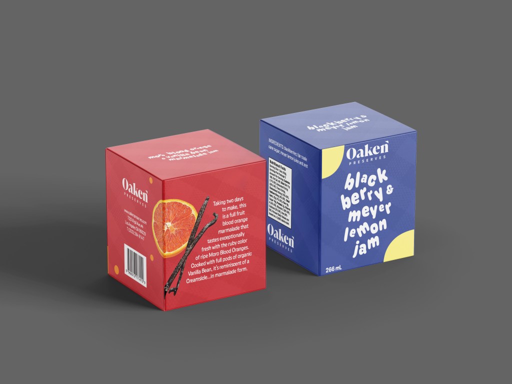
PROCESS: For this project, I had to make packaging that would contain four different jams. It was my job to make the packaging cohesive without feeling like all the packages are the same. I thought it would be best to keep the background imagery the same, but to highlight the different colours and ingredients in the jam.
I built the packaging in Illustrator and then did the design in InDesign. I chose a light overlay of a picnic blanket to give the design a warm feeling. I used photos of ingredients with a text wrap nearby to emphasize the natural ingredients and closeness that the brand wanted the customers to feel with them. I chose a fluid font to look as if it were almost written in jam, but still look professional.
REFLECTION: From this project, I learned a lot about measuring and precision through creating the label. I got a lot of practice being very thorough in InDesign and Illustrator, and working to make sure digital files work the same when printed.
